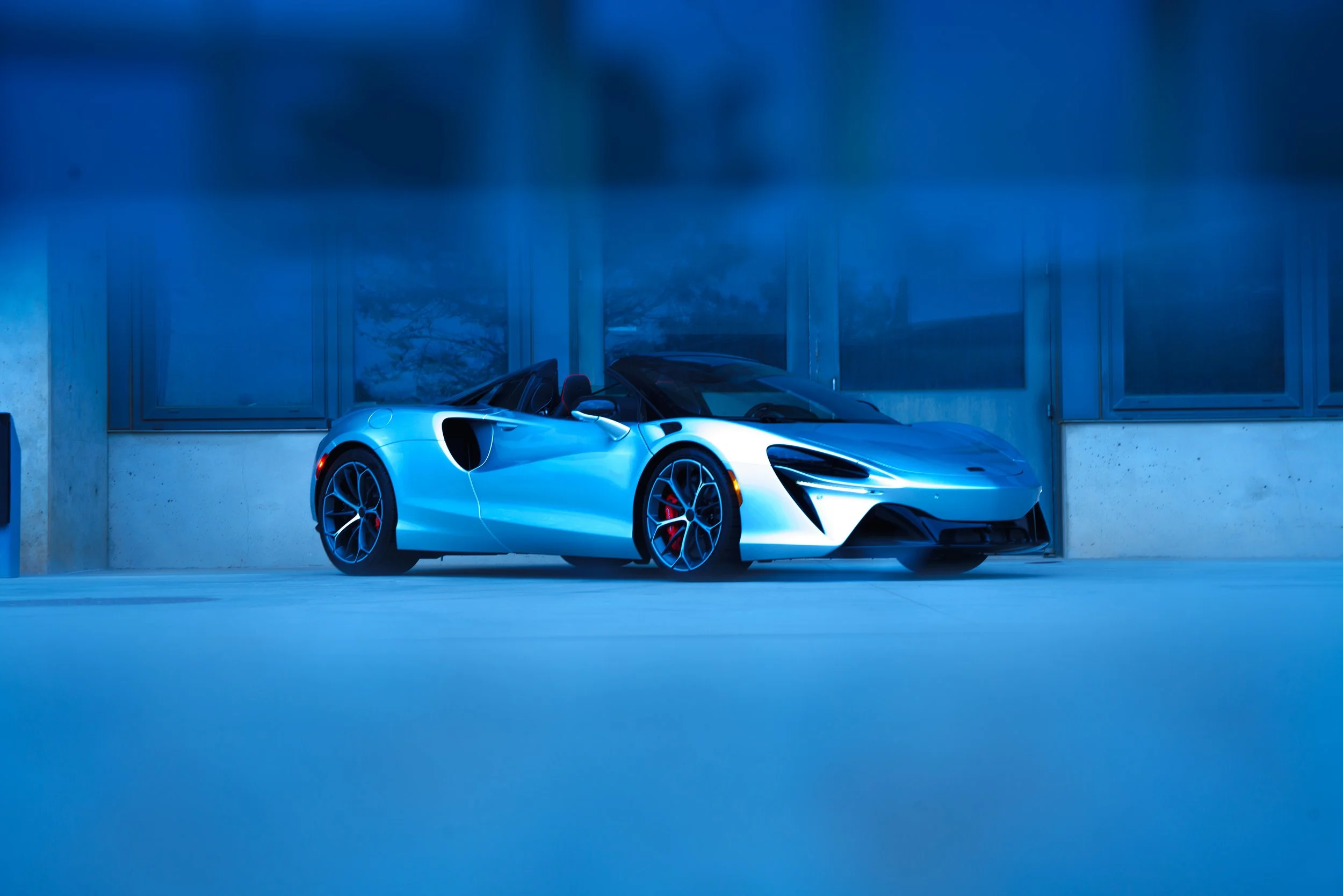
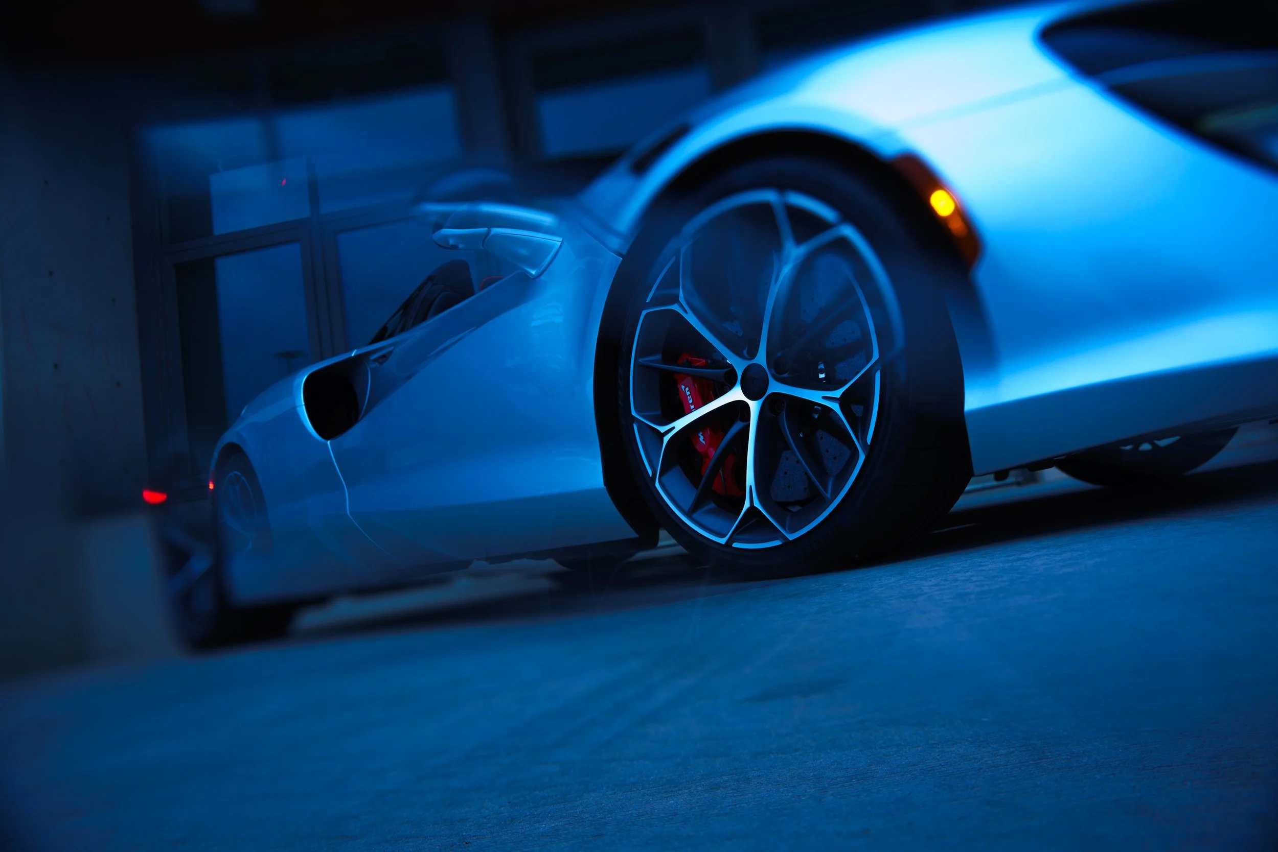
The Supernova Silver McLaren Artura became the foundation for a more stylized, color-driven approach—leaning heavily into contrast, atmosphere, and controlled exaggeration inspired by Aaron Brimhall’s visual language.
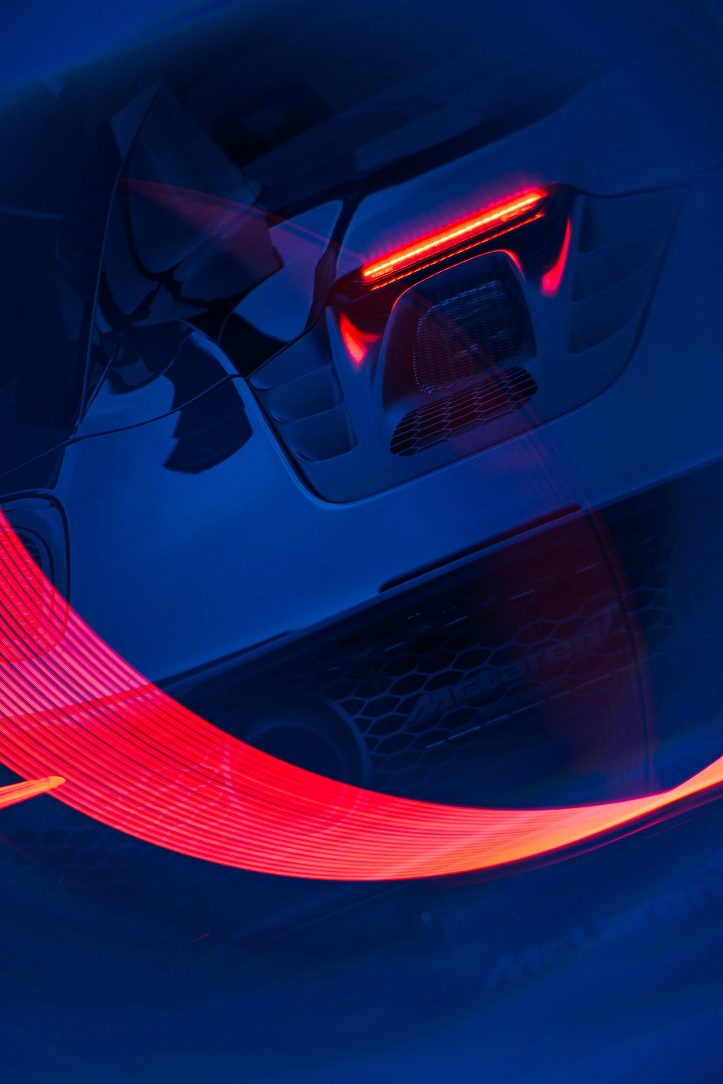
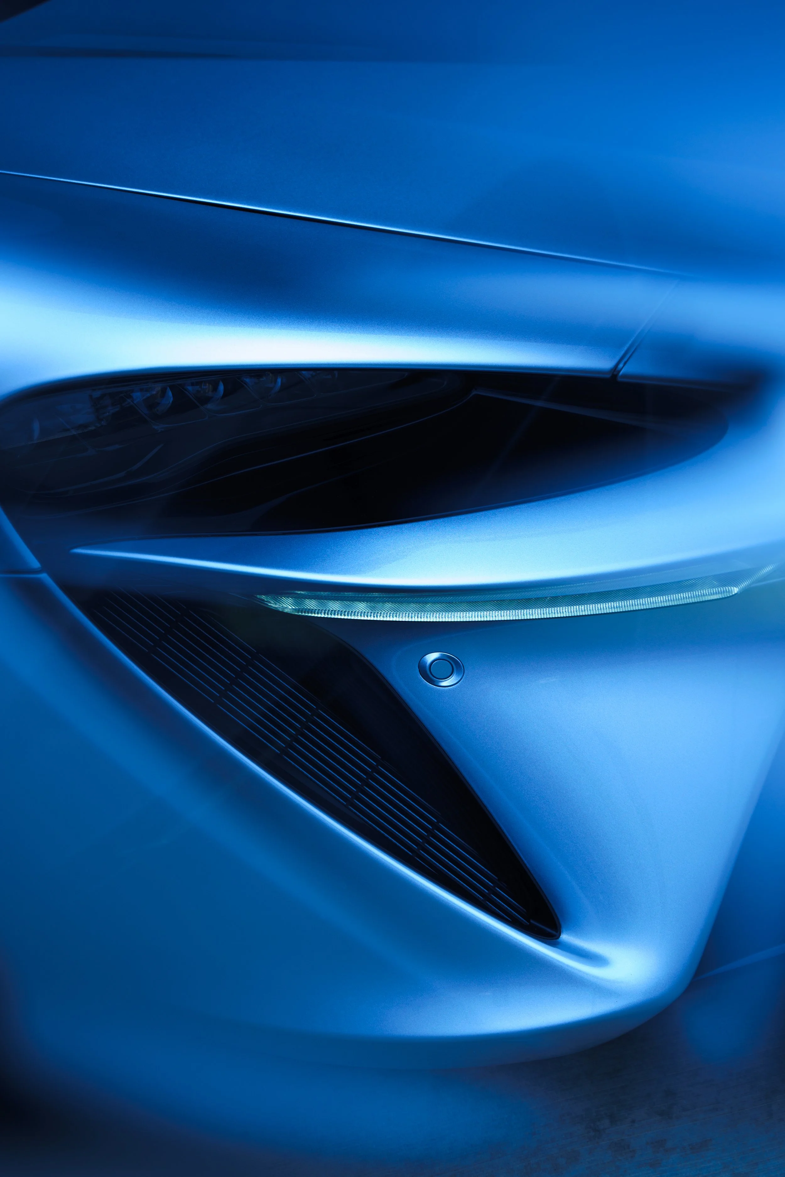
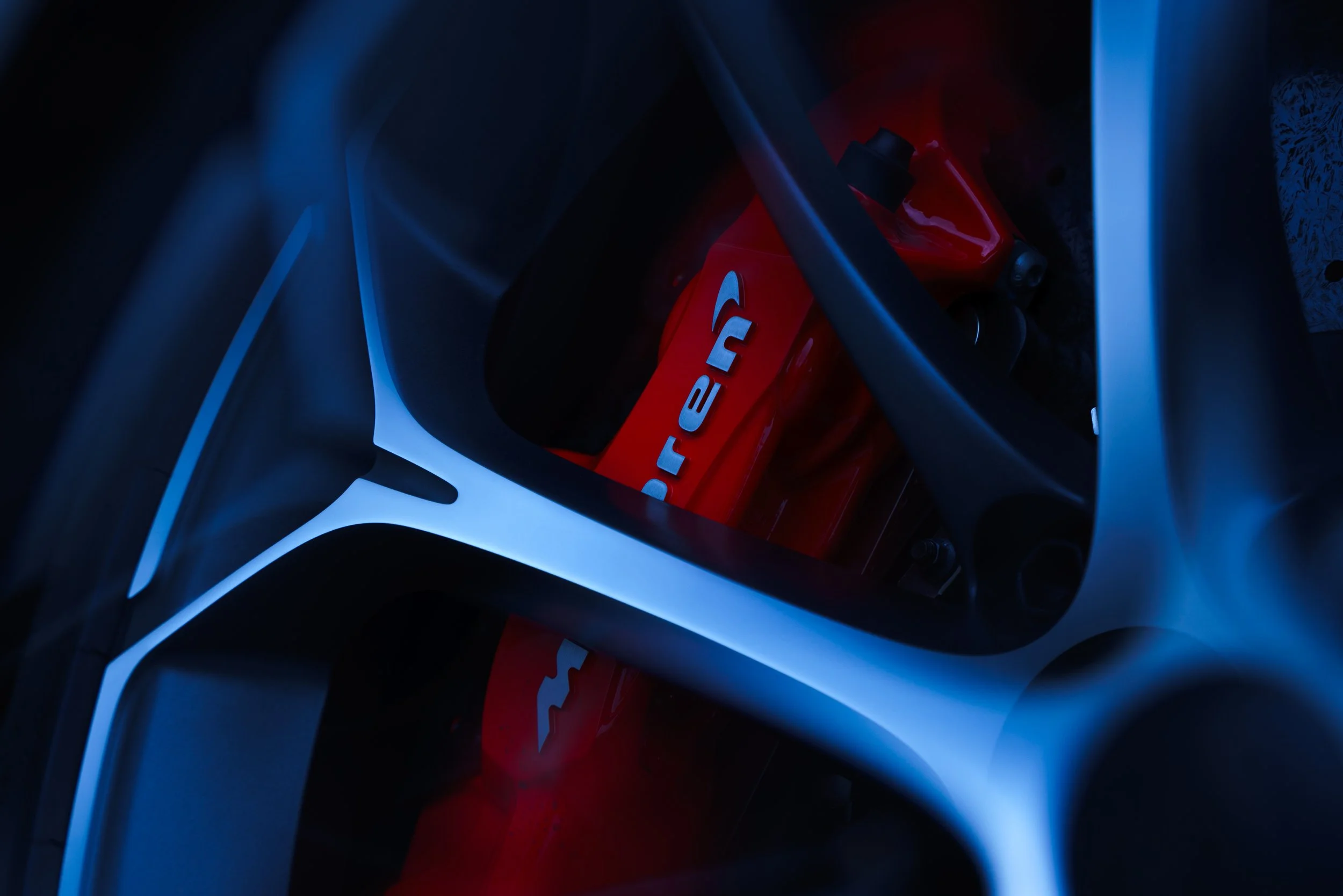
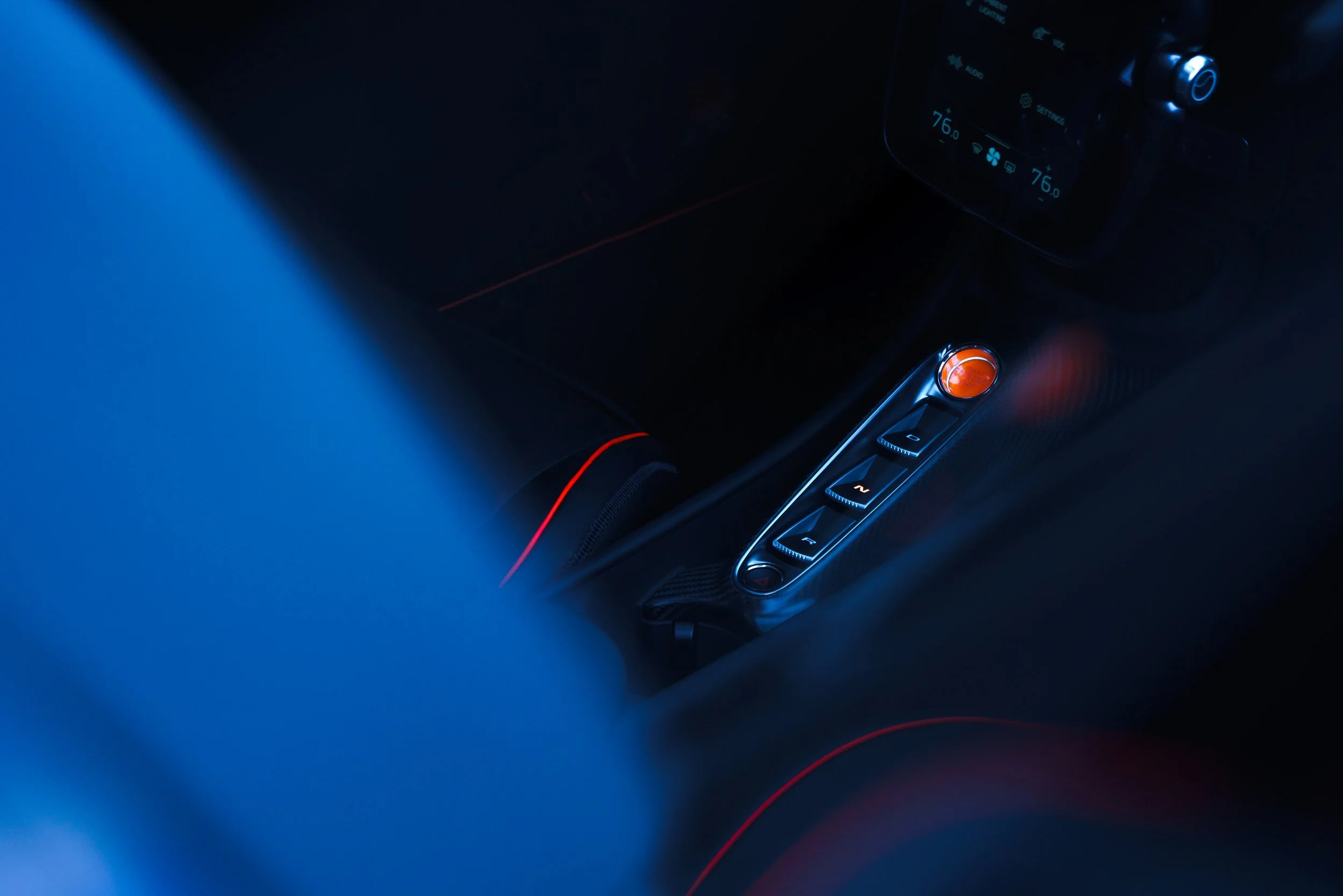
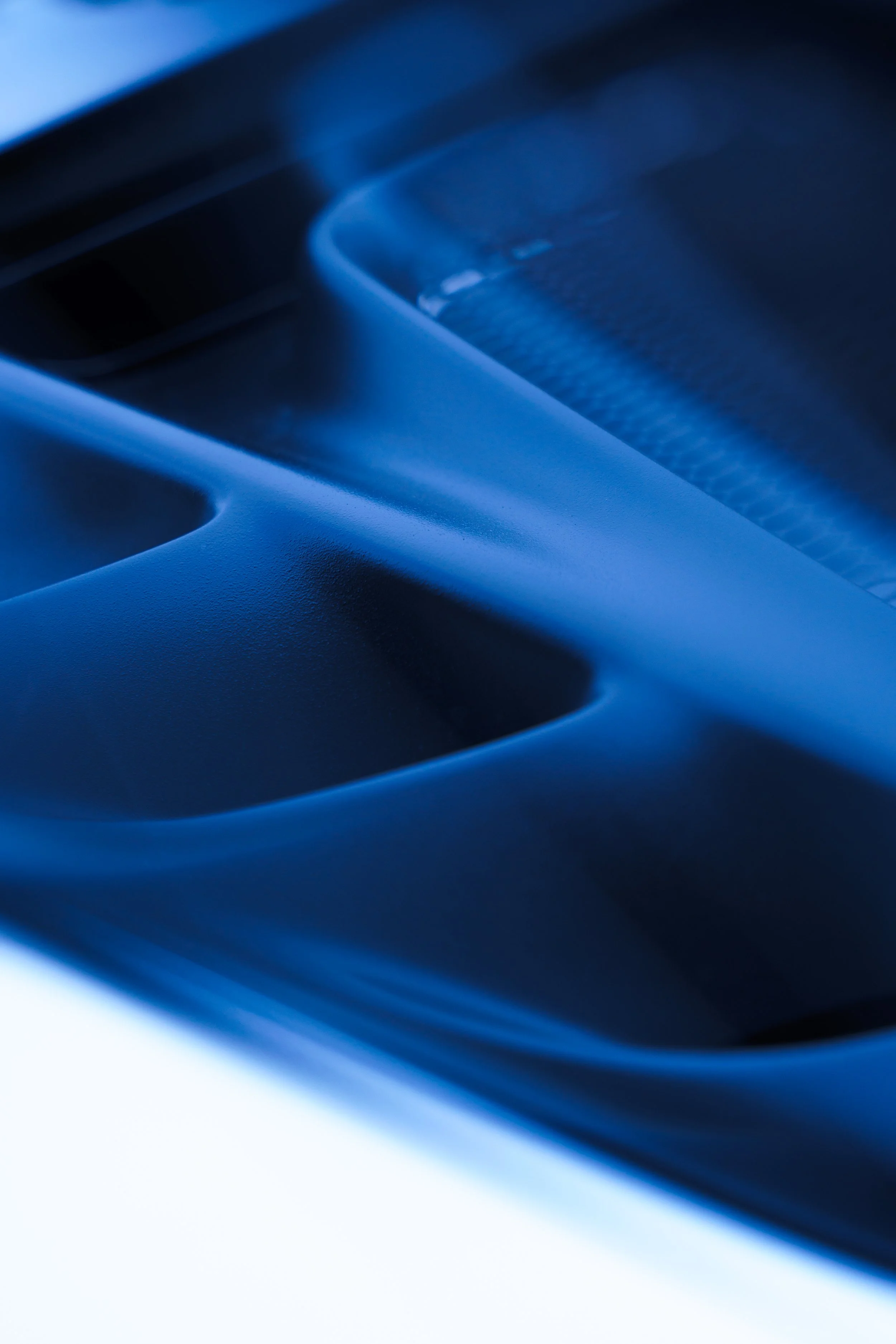
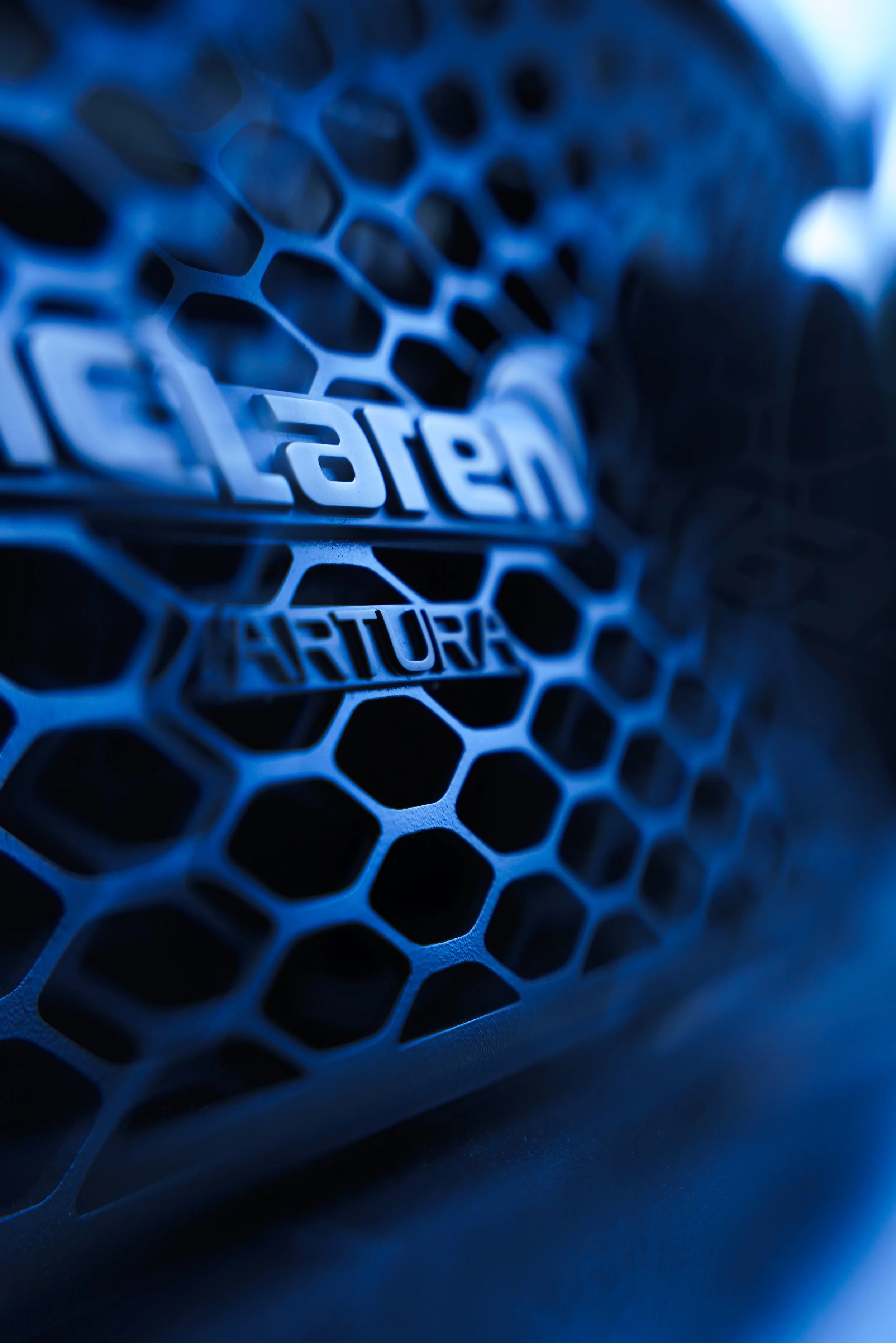
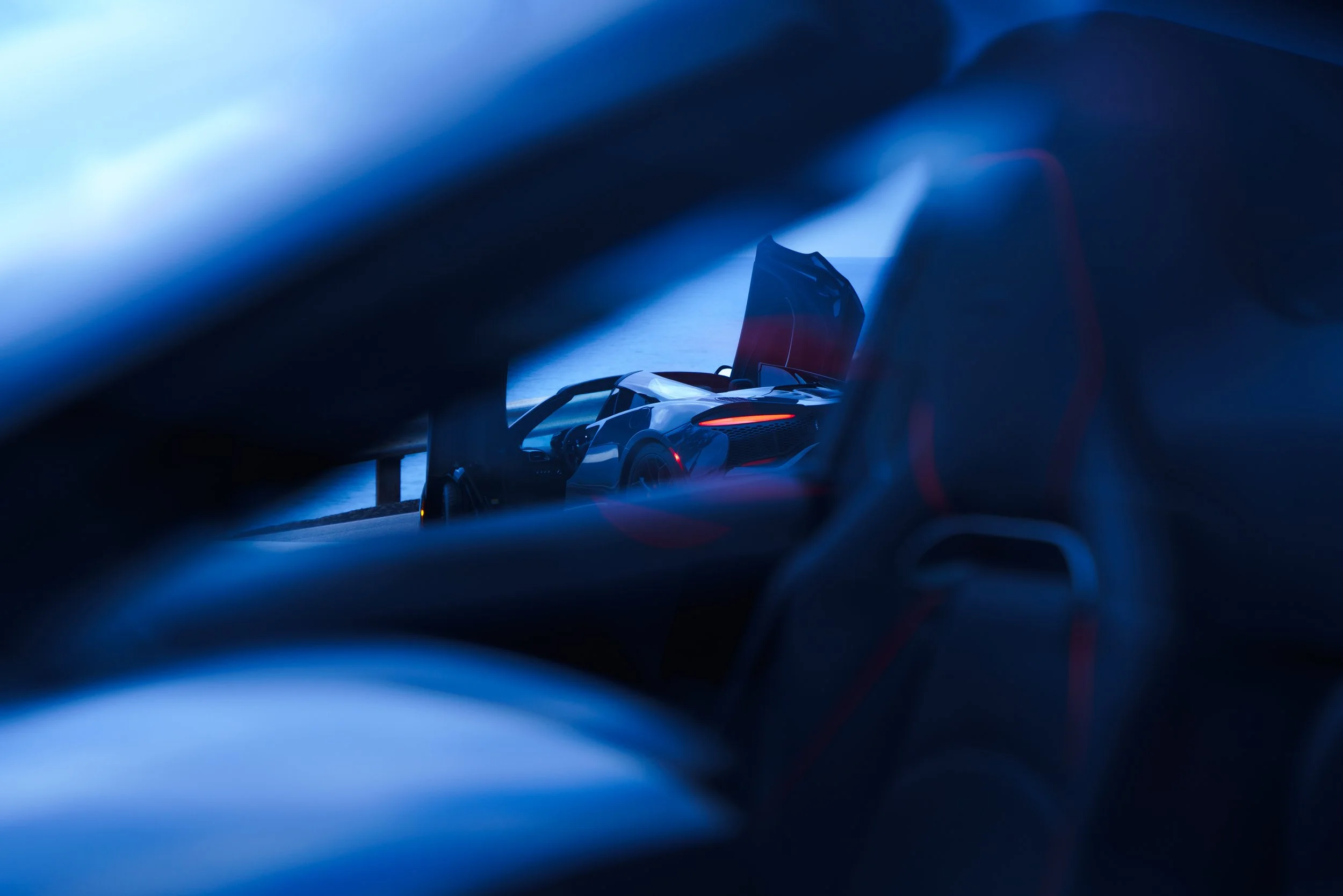
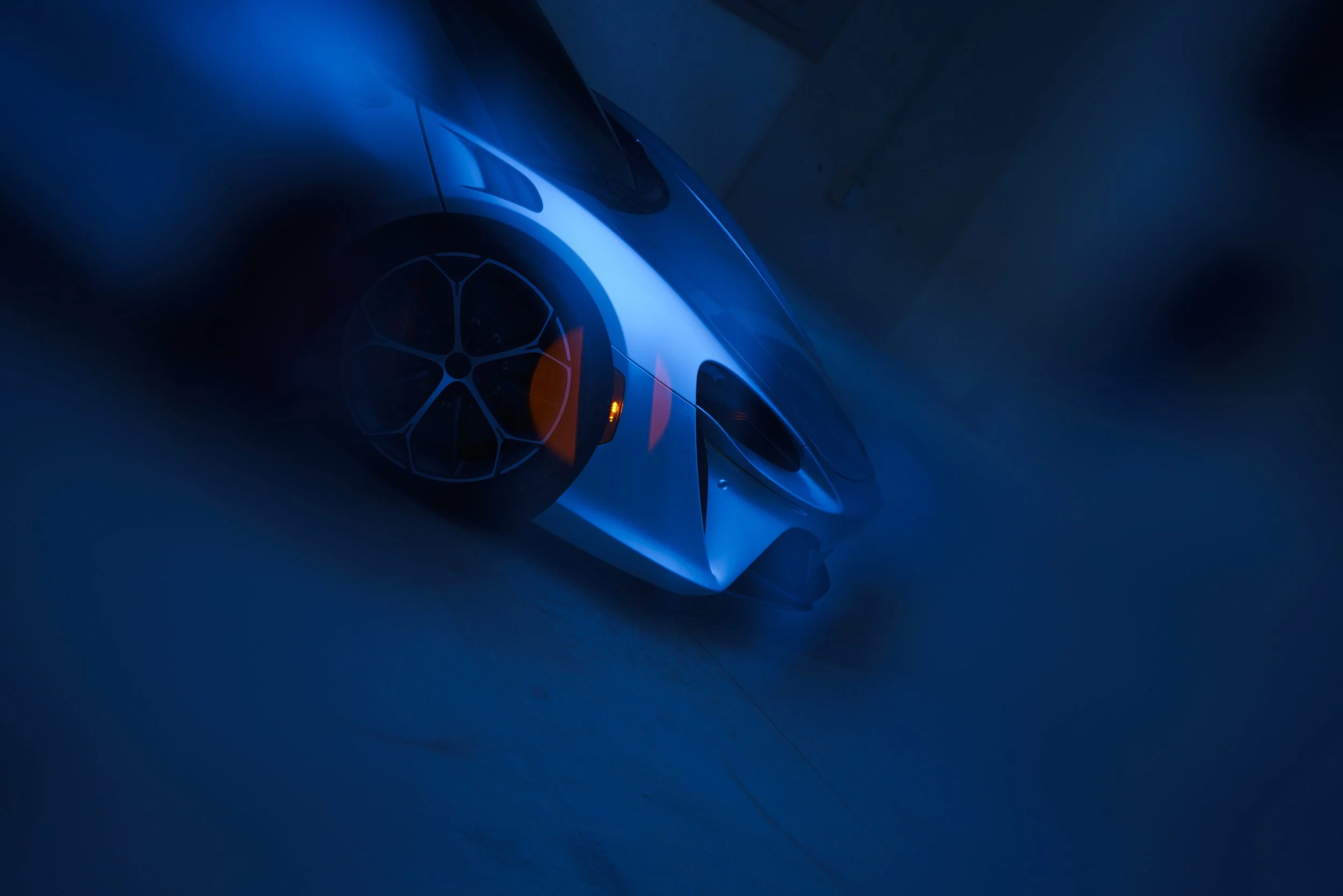
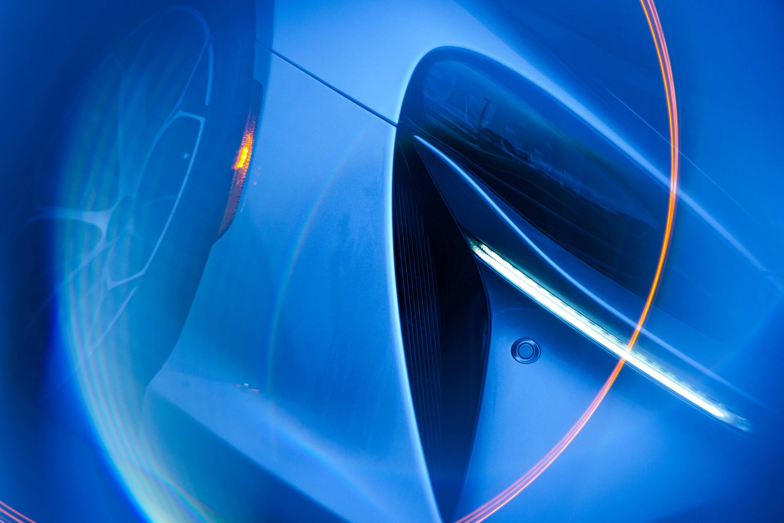
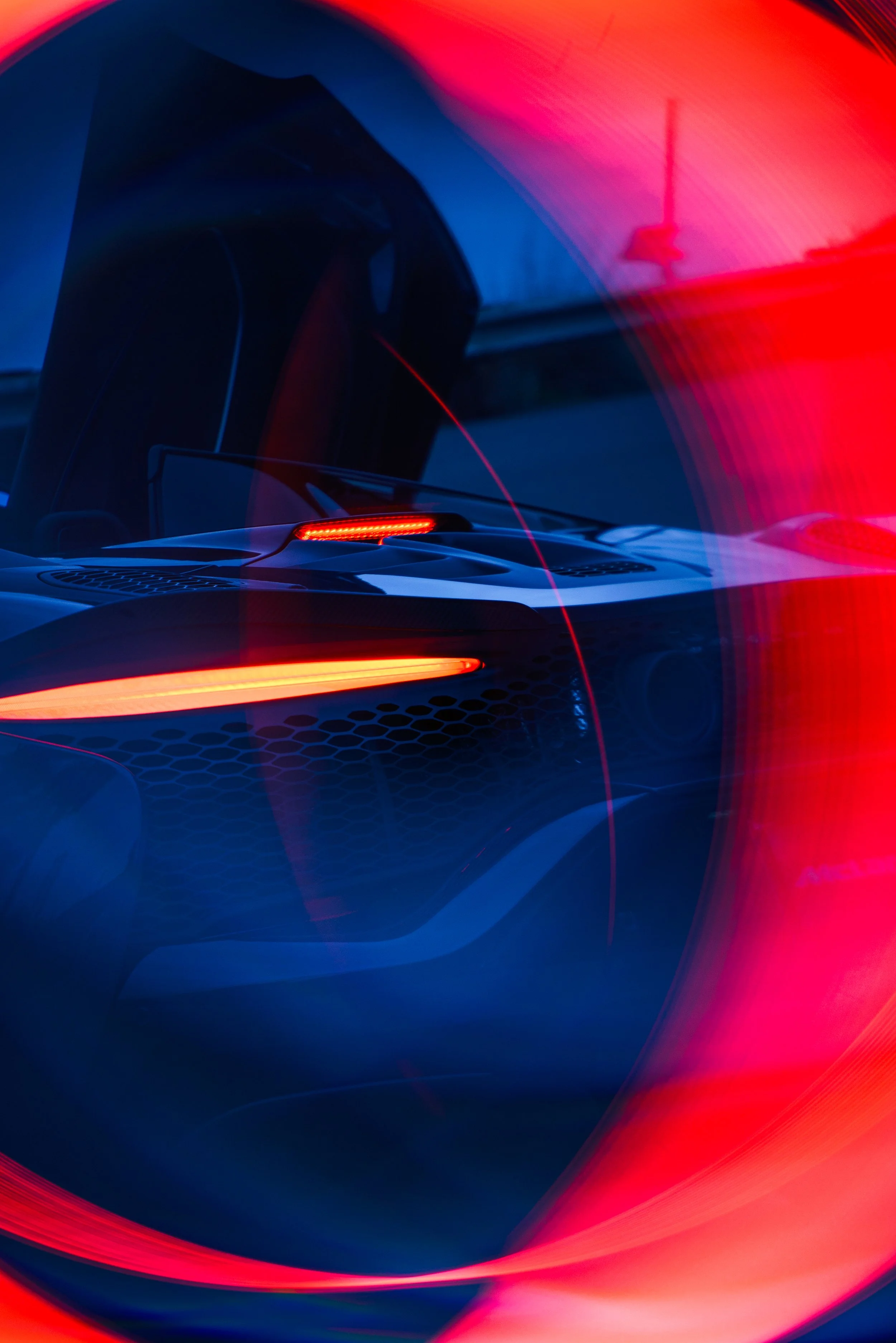
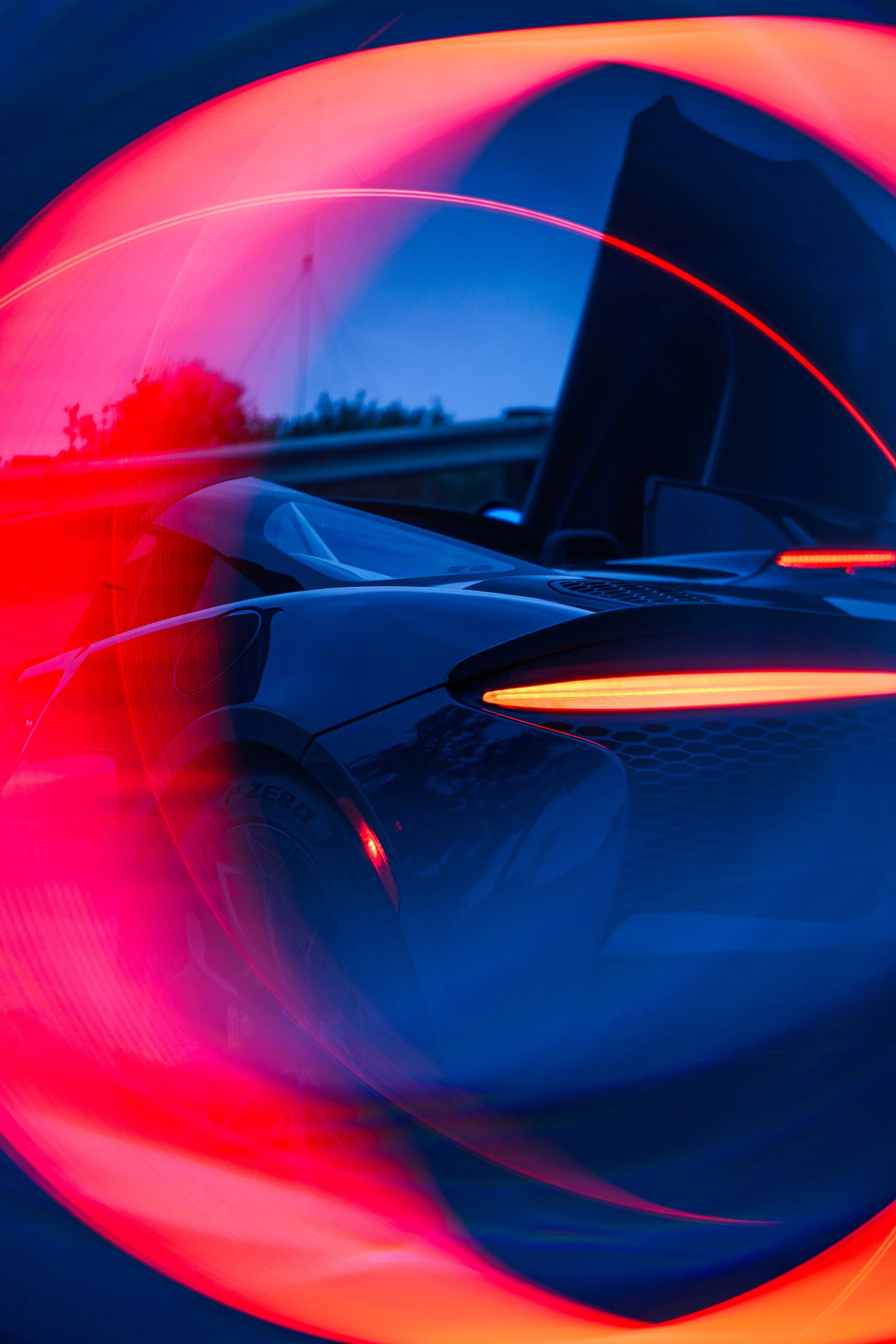
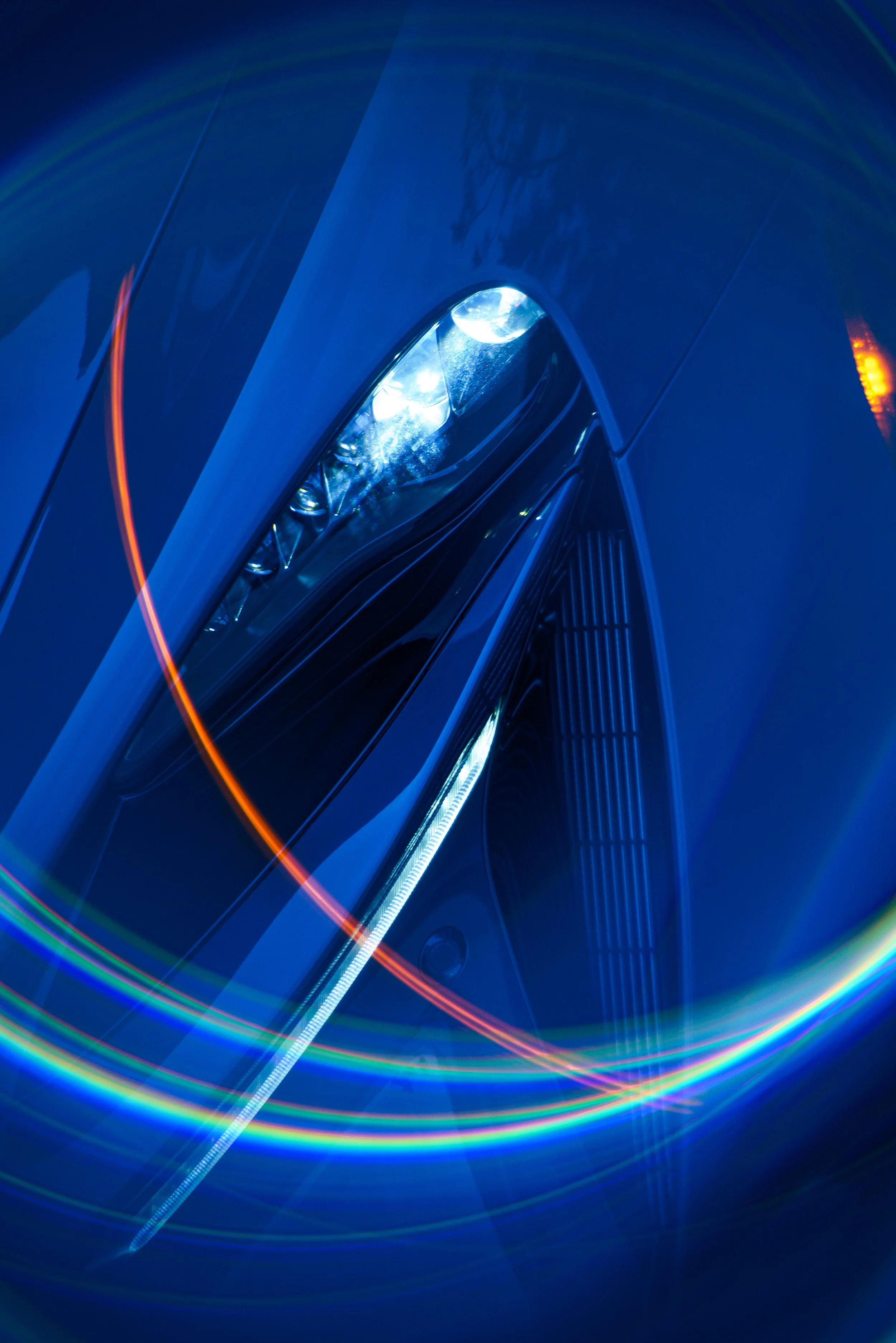
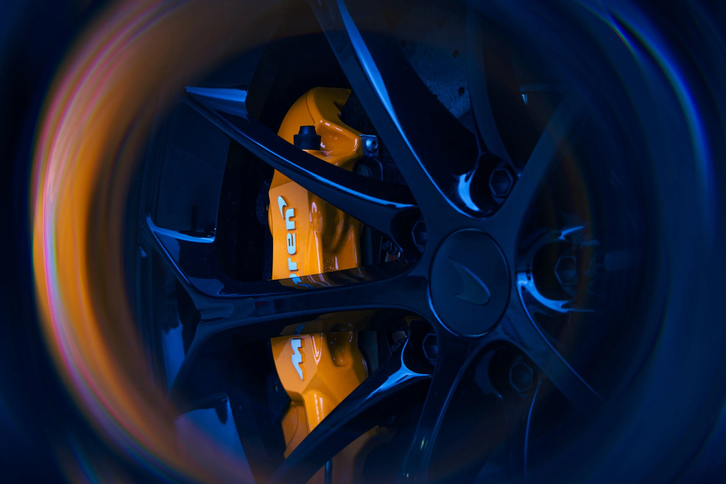
This set moves beyond neutral representation, using a cool-toned blue preset as the base to reshape the environment and mood. Against that foundation, deep reds were introduced and emphasized, creating a striking color contrast that pulls the viewer’s attention across the frame. The silver bodywork acts as a reflective surface, absorbing and translating these opposing tones in a way that feels dynamic and intentional.
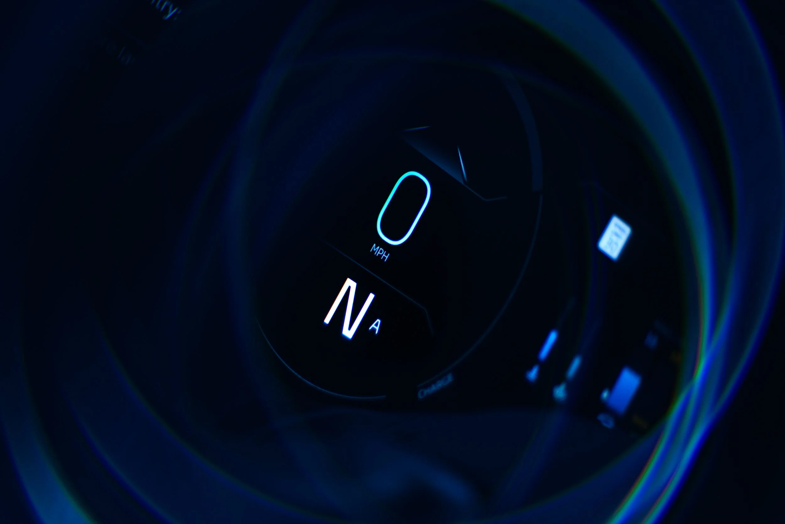
Lighting and grading were designed to feel cinematic rather than corrective. Highlights were pushed to carry subtle blue hues, while shadows were allowed to fall into richer, more dramatic tones. The red elements—whether in reflections, accents, or environmental spill—serve as anchors within the composition, giving each image a sense of depth and direction.
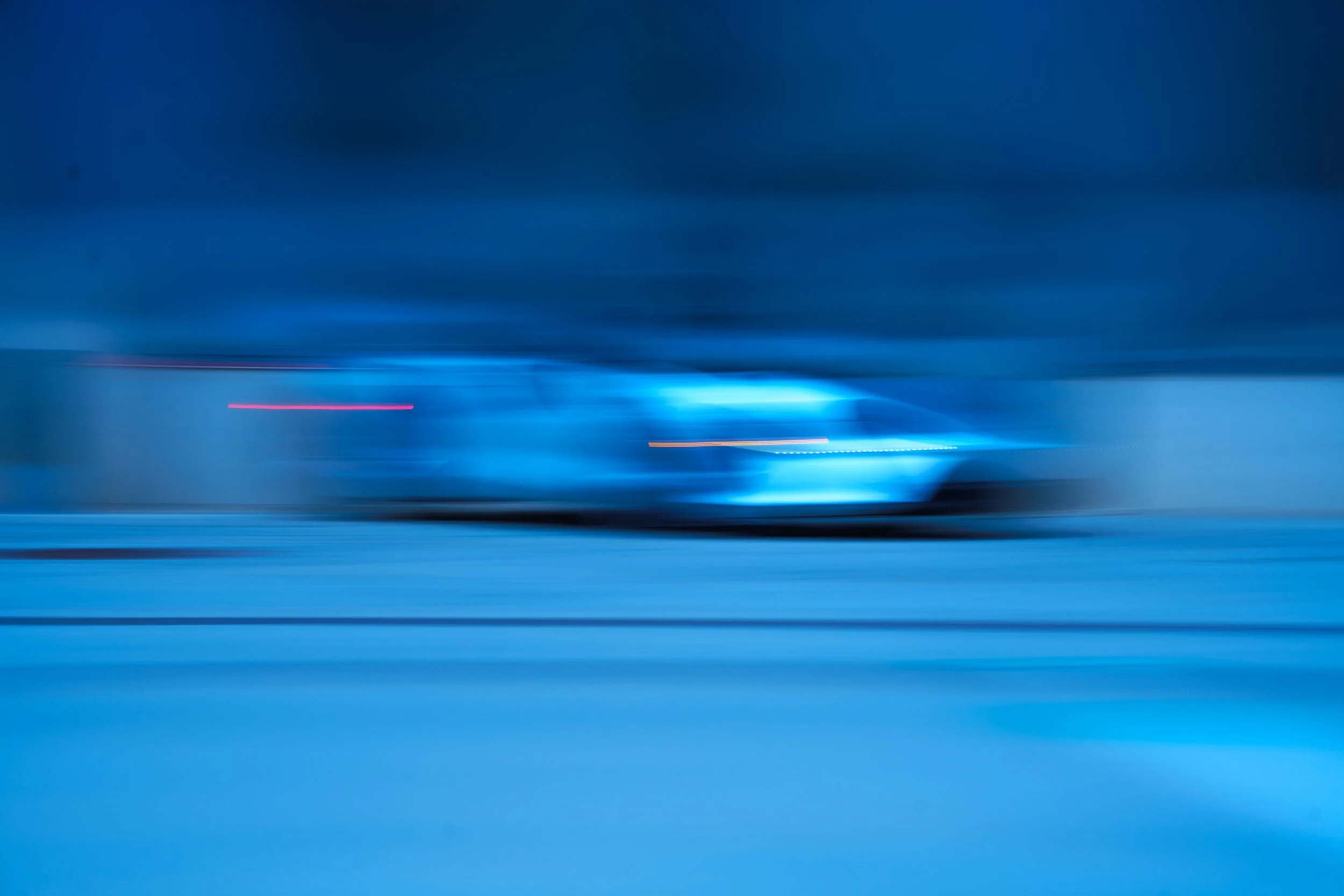
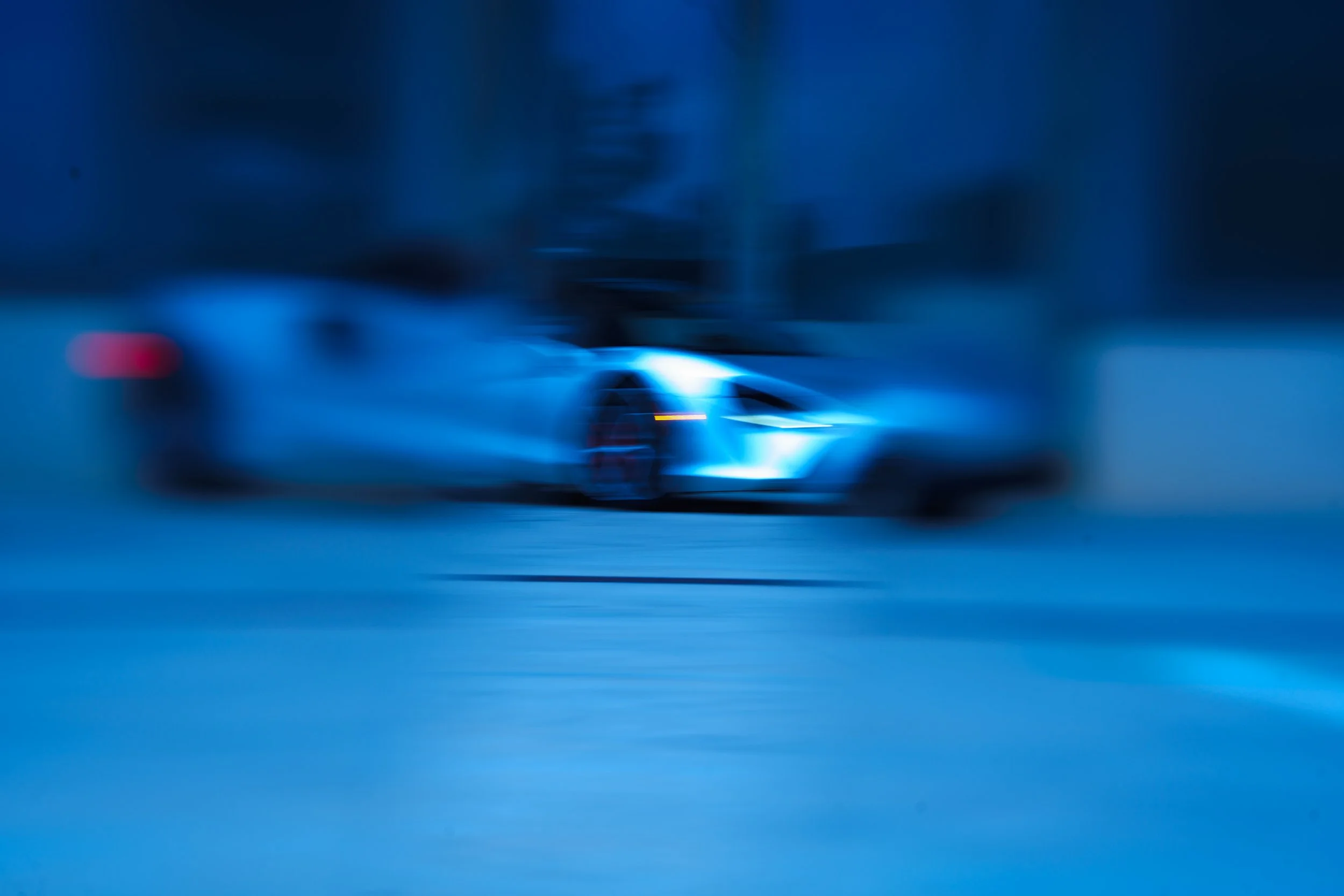
The overall approach prioritizes atmosphere over accuracy. Color is treated as a tool for storytelling rather than documentation, shifting the Artura from a clean commercial subject into something more immersive and stylized.
The result is a set of images that feel bold and deliberate—where contrast, color tension, and mood take the lead, and the Artura becomes part of a larger visual narrative rather than the sole focal point.